Subs365
Designing a mobile application to track subscriptions
.png)
project type
Personal Project
role
User Research
Wireframing
Prototyping
Usability Testing
tools
Figma
introduction
Consumers find themselves losing track of their subscriptions, resulting in financial leakage
This case study explores the design of a user-centric solution aimed at simplifying the management of subscriptions. By addressing this issue head-on, I seek to empower users with the tools they need to regain control over their subscriptions, optimize their spending, and create a more seamless and transparent digital experience.
problem statement
Keeping track of monthly subscriptions is challenging, causing financial leaks and frustration.
research & user interviews
Users have challenges managing their subscription
Managing subscriptions is a widespread issue, resulting in financial inefficiencies and user frustration. The lack of user-friendly solutions necessitates a tool offering clarity and control.
The primary objective of this research is to gain a deep understanding of users' experiences and pain points related to subscription management. I interviewed 5 people over Zoom to identify specific user needs and preferences when it comes to tracking, modifying, or canceling subscriptions.
Objectives for 1:1 Interviews
-
Understand the common challenges users face when managing their subscriptions
-
Identify key pain points users encounter when trying to track, modify, or cancel subscriptions
-
Find out how users currently keep track of their subscriptions, if at all
-
Understand users’ experiences with current subscriptions
findings
Users wish to gain an overview of their subscriptions to make better financial decisions
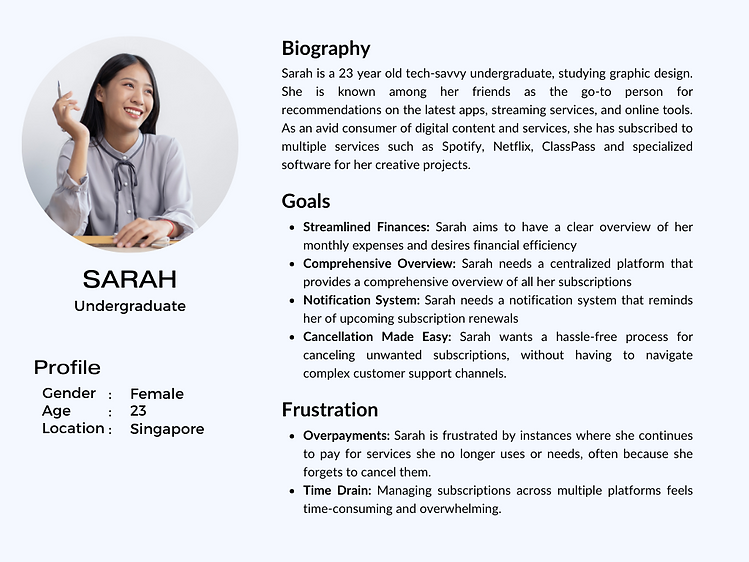
Though I spoke to two demographics of people, their needs and pain points were similar enough to combine into a single persona. I created this as a synopsis of my research to present to the clients.
design process
With design priorities in mind, I began planning the information architecture and user flows. During the interview, one of the users brought up an interesting point, drawing an intriguing parallel between the subscription management app and the intuitive layout of a stock trading app.
The idea revolves around creating an interface that is not only easy to grasp but also provides users with clear visibility into their active subscriptions and their financial reports. This user-driven concept will serve as a guiding principle in shaping the app's user experience.
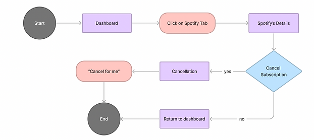
Based on the main tasks we wanted the user to accomplish on the application, I created two user flows to identify potential drop-off points and user choices to design for.
Legend
User Flows: Canceling Subscription
User Flows: Viewing Financial Reports


low-fidelity wireframes
I explore how a feed of subscriptions could look through sketching
I focused on enhancing user convenience by providing a clear view of upcoming subscription renewals through the dashboard and calendar. Additionally, I streamlined the subscription cancellation process for effortless management.


high-fidelity wireframes
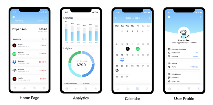
I translated my idea onto Figma
I focused on enhancing user convenience by providing a clear view of upcoming subscription renewals through the dashboard and calendar. Additionally, I streamlined the subscription cancellation process for effortless management.

reflection & next steps
"Who" instead of "What"
Over the past month, it was a pleasure to watch my idea slowly take shape and come to life. The process of designing this product was a journey fraught with lessons and insights into who I am as a designer. My design decisions were made with the user in mind. Decisions became simpler and easier to make the more I understood the “who” instead of being bogged down with the “what” of the design.
For the next steps, I would continue to conduct regular user testing for future iterations and new features. Additionally, I would like to expand on the product's features in order to address other pain points when it comes to managing subscriptions.